


Super.com is an all-in-one app that puts more money in your pocket. Save on hotels, get cash advances, cash back, boost your credit score, earn money playing games, and more.
Role: Product Designer
Team: Product Manager
1: Updating the Cash Advance Landing Screen
Problem:
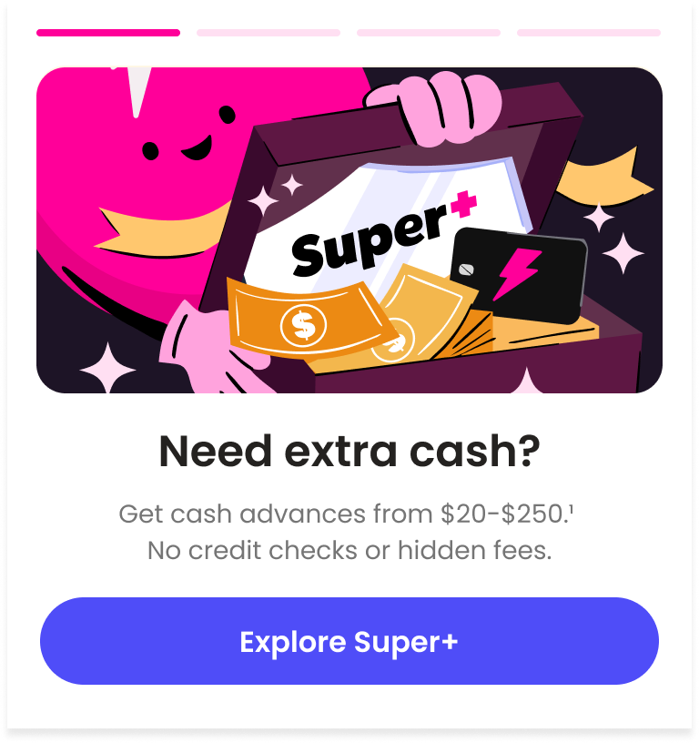
Super.com offers a Super+ membership that comes with various benefits, including access to cash advances. Upon enrollment, users receive a secured Super.com Card. Cash advances are directly deposited into this card, and users can also add funds manually. However, the support team has noted a significant number of support tickets indicating confusion about the cash advance feature and its functionality with the Super.com Card. Causing high cancellations and unhappy customers.
Solution:
To enhance the overall user experience, my product manager and I advocated for more transparency regarding our membership terms at the initial point of contact. We analyzed user acquisition data and found that most users were coming from meta ads. To ensure a consistent brand experience, we decided to launch a new landing page that closely mirrored the style of the ad and was aligned with our product design system.
Our Data
Data showed that 34.6% of card-related customer care tickets were from users trying to withdraw funds. This indicated a significant gap in user understanding and expectations, particularly regarding how the cash advance feature operated.
STEP 1
Aligning Brand & Product
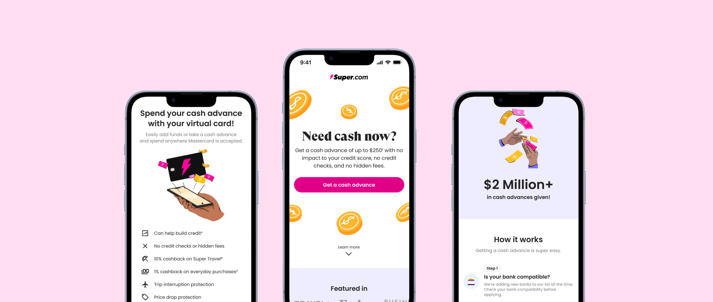
We noticed a branding inconsistency on the cash advance landing page, specfically for users coming from Meta Ads. To address this, I prioritized aligning the landing page with our brand and product. I focused on redesigning the above-the-fold section to ensure that it reflects our brand identity and creates a cohesive user experience.


→
Previous Landing Screen

→
Redesign Landing Screen
STEP 2
Adding Transparency
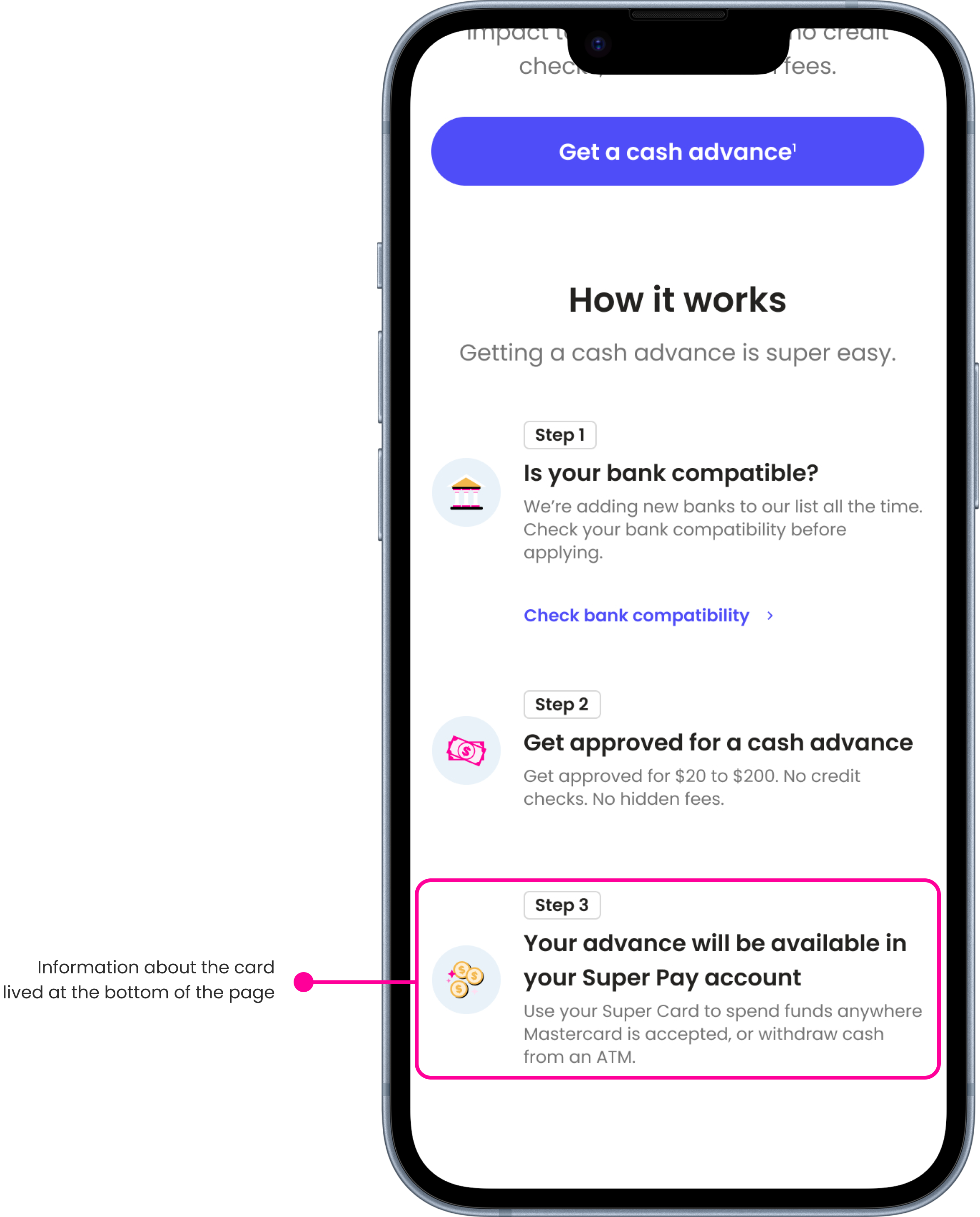
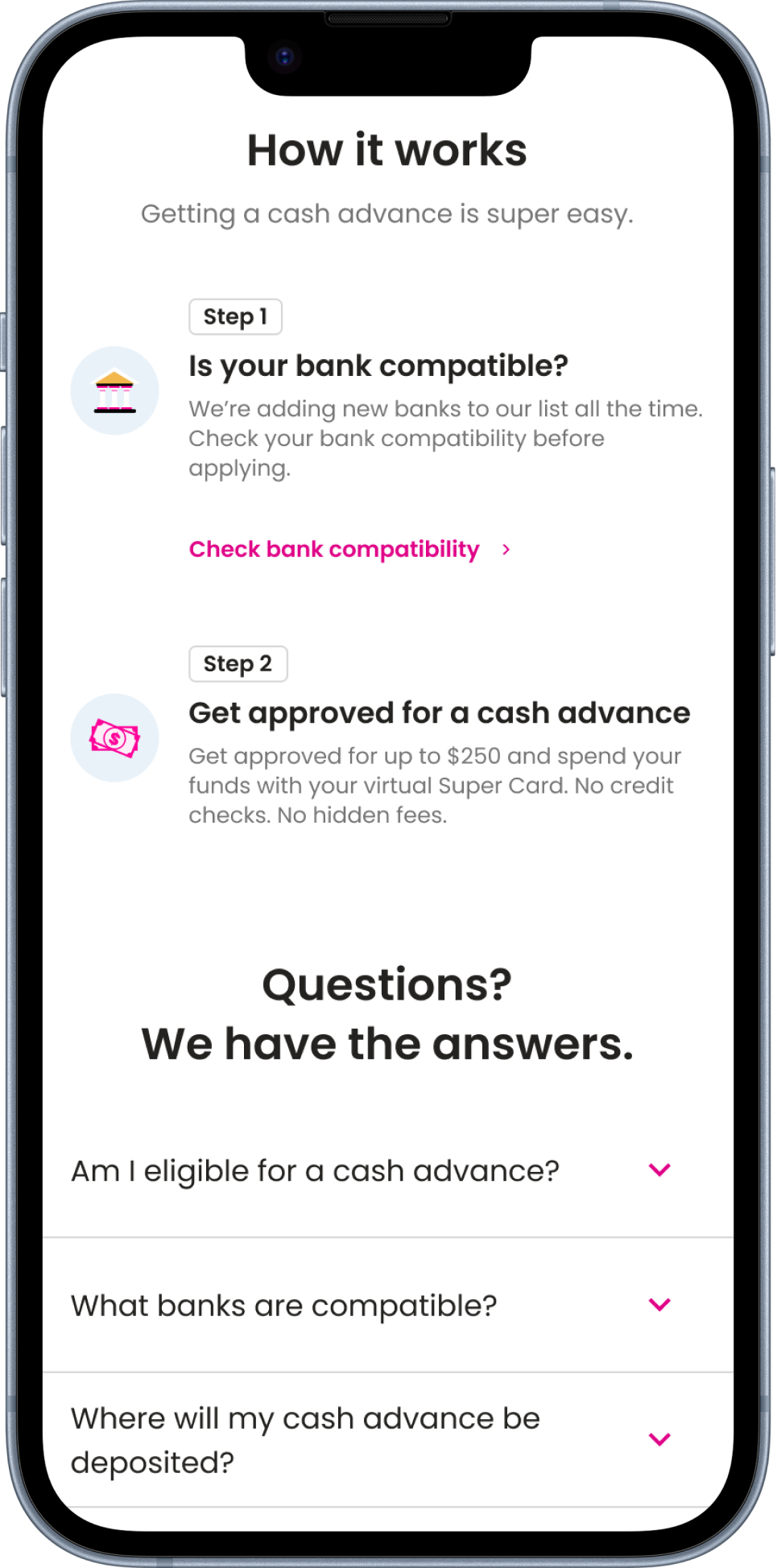
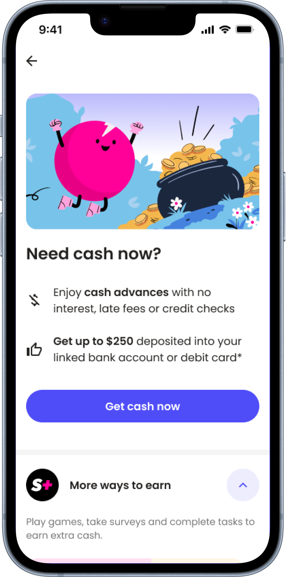
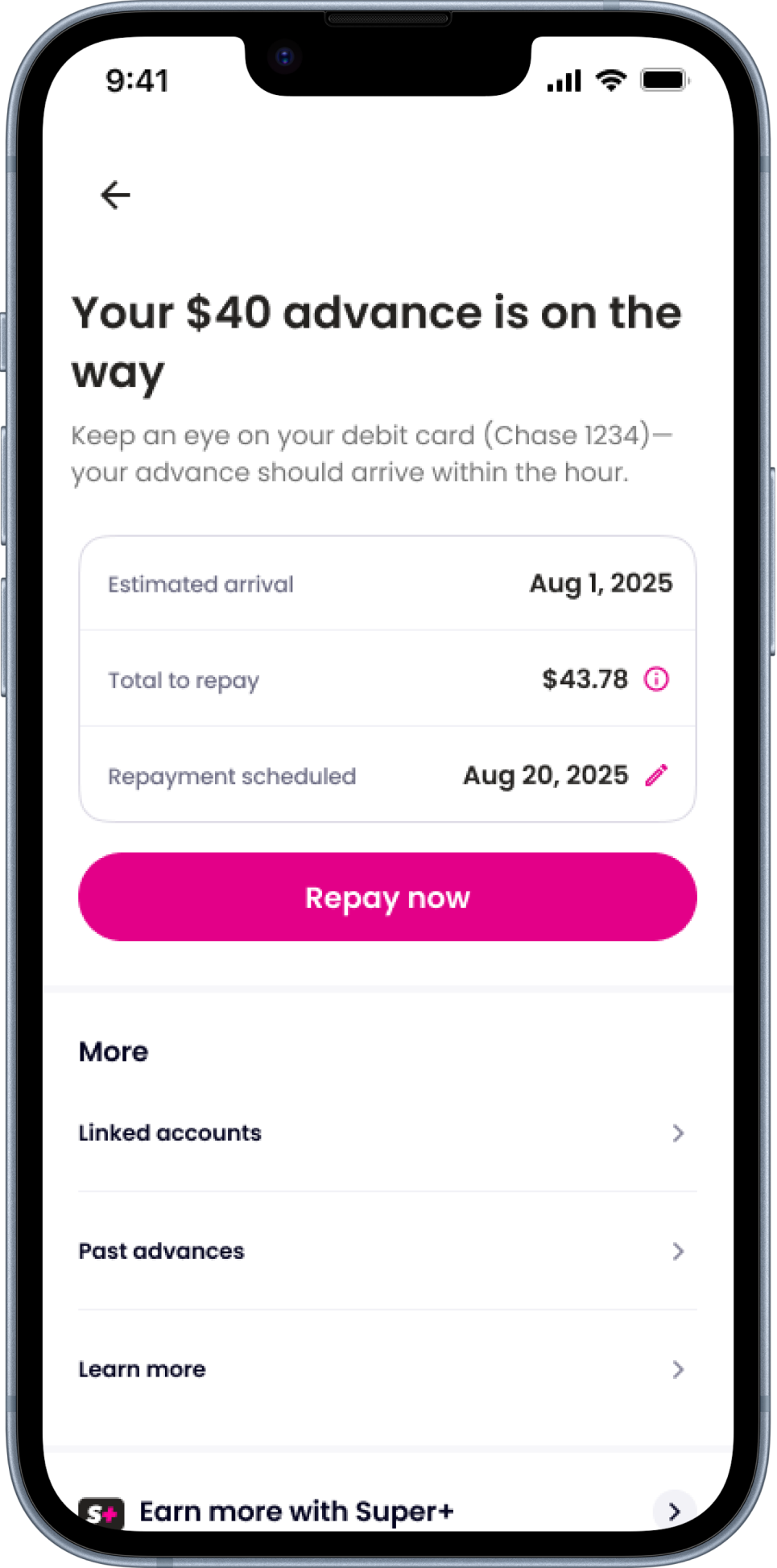
The previous landing page didn’t make it clear that users needed to use their Super.com Card to spend their cash advance. Most of the information about the card was buried in small text at the bottom, which led to confusion and a lot of complaints from users trying to withdraw or transfer funds to their bank accounts. To fix this, I revamped the page to highlight key details and benefits of the Super.com Card right at the top, so users understand the process upfront.
Previous Screen

Redesign
STEP 3
Social proof to build trust
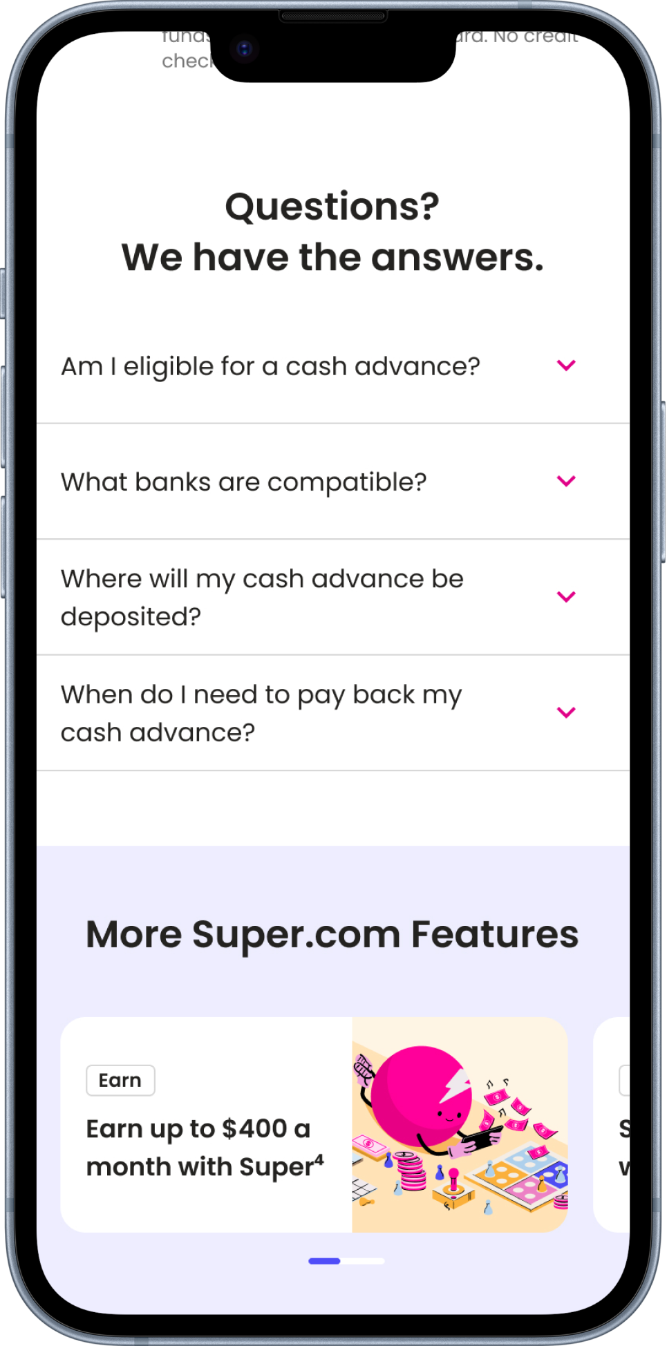
We noticed that the previous landing page lacked social proof, and our team hypothesized that by incorporating where we’ve been featured and highlighting the number of cash advances we've provided, we could enhance user trust and boost the product's credibility. This also aligns with our overall brand strategy, as social proof is a key element showcased throughout our website and on the Google Play Store.


Final Experience
Results
We observed an 11.4% relative increase in click-through rates, indicating enhanced user interest and interaction with the landing page.
We saw a 6-12% lift in manual card funding
We ran a Dark mode test right after, and it resulted in a 9-10% decrease in Super+ cancellations
There was a 9.5% relative increase in Super+ conversions
75% of users scrolled far enough to see the card information, and 50% reached the bottom of the page. Previously, only 50% of users scrolled halfway down the page.
2: Updating Super+ Ad on Homepage
Problem:
Super.com offers a Super+ membership that comes with various benefits, including access to cash advances, travel discounts, credit building, earning opportunities and. more. the Super+ Hero ad on the homepage only highlights 10% off travel as it’s #1 benefit, while calling out other benefits. Though - given over 50% of users who are downloading the app is coming for cash advances, 25% of users coming in for earning opportunities and only 10% of users coming in to save for travel; our current hero ad does not match towards the benefits users expect coming in.
Solution:
In order to improve Super+ conversion and gather insights, I worked with the product manager and the brand designer to create a new component that involved Super+ ads targeting specific value props from the membership. The goal here was to elevate the value prop that is most popular in order to drive conversion. This was just one stepping stone toward making the homepage more customizable for the user. This gave us the foundation to prioritize the appropriate tiles and hero ad for users based on their stated intent.
Our Data
Through surveying our users, we found that over 50% of users download the app to get a cash advance, 25% are looking to earn. Only ~10% are looking for travel savings. Our Super+ Hero ad has a 1.46% view to click rate for unauth users. Auth users click at 1.95% rate. These are extremely low engagement rates, taking up precious real estate space on our homepage.

STEP 1
Addressing issues
Taking a look at the first ad, there were a couple of things missing. The ad didn’t live above the fold and was targeting more travel-intent users. When the user clicked on the ad, there seemed to be a disconnect as we introduced the concept of the wallet. The Super+ membership isn’t just a wallet, but a multitude of things that a user has access to. We decided to add more clarity and transparency to the Super+ membership while working on the new ad component.

Previous Super+ Ad

Previous Super+ Ad (Drawer when opened)
STEP 2
Iterating on components
While working with the Brand designer, we came up with multiple options that would both align with our product and brand. Although adding an image could be eye-catching to the user, we noticed it took too much space and majority of the essential information started to get lost. Dark mode although unique, did not align with our current modern and pink theme.
→

→

Finalizing Ad component
Taking a look at our overall product, we noticed a consistent theme of rounded corners and fun imagery. We added a enough space for fun illustrations and kept it on brand by utilize our pink that represents our mascot.

STEP 3
Updating drawer
For this specific initiative, I got the opportunity to work with a content designer. We collaborated on copy and which value prop should be elevated on the drawer. Redesigning the Super+ drawer involved starting from scratch. As you can see, the drawer before did not include all of the value that Super+ provided. The goal here was to provide as much context as possible for the user so they can fully understand the Super+ membership. Although the drawer did become longer and more text-heavy, our users in the past have made it clear that they prefer more context and transparency.
Previous Super+ Ad (Drawer when opened)

Redesigned Super+ Ad (Drawer when opened)

Final Experience

Results
We hit our primary metric of increasing new subscriptions from the hero ads; with updates to the new Hero ads as the winning variant. Updating both the Ad and the Super+ information drawer drove more users to start their subscription funnel.
3: Testing the Cash Advance Hub
Problem:
The Cash Advance feature was a relatively new addition to the Super+ membership, and had not undergone sufficient usability testing. As a result, customer support saw a disproportionate number of tickets related to this feature, signaling potential issues with clarity, trust, and overall user experience. As the lead designer, my objective was to evaluate the Cash Advance flow end-to-end to identify usability gaps, uncover trust barriers, and determine where the experience was failing users.
Solution:
Based on the insights from the current Cash Advance experience, I designed and tested an improved version that scored much higher in trust and usability. The updates focused on increasing product transparency, modernizing the UI, and refining the dialogue throughout the flow. With strong test results, the team plans to implement this version in production to deliver a clearer and more trustworthy user experience.
STEP 1
Testing the current Cash Advance experience
The main goal of this first usability test was to check our entire Cash Advance (CA) experience, which includes signing up (onboarding) and the main CA Hub. We had never tested this before, so we needed to gather simple data to see what worked and what didn't so we could fix it. The test proved my hunch that the experience wasn't clear was right. Users were confused because important terms and fees were missing during sign-up , and especially because the main CA Hub did not change or update two days after they got the money.
Example Screens
Usability Results for Test #1
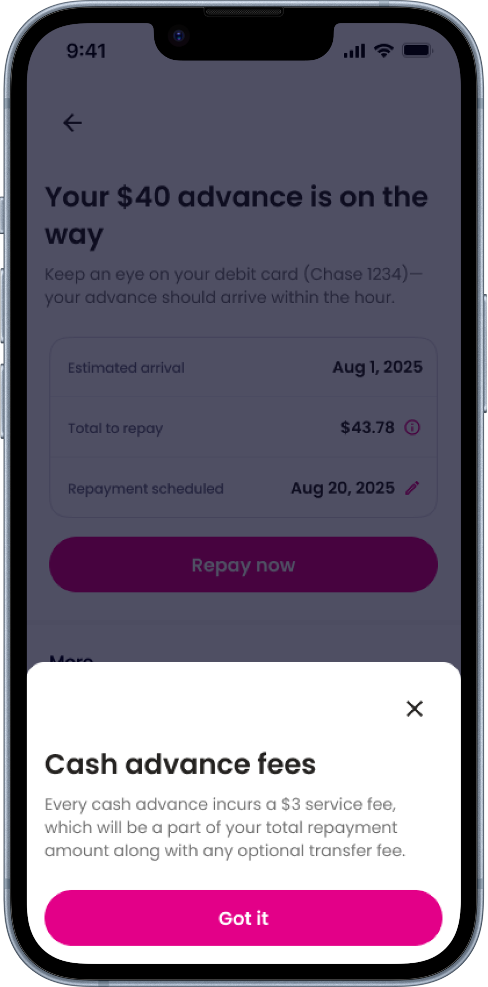
Missing Transparency on Sign-Up (Terms/Fees): A majority of users (3/5) felt that crucial terms, including fees and how the cash advance works, were missing from the initial "Need Cash Now?" screen, causing confusion and hesitation.
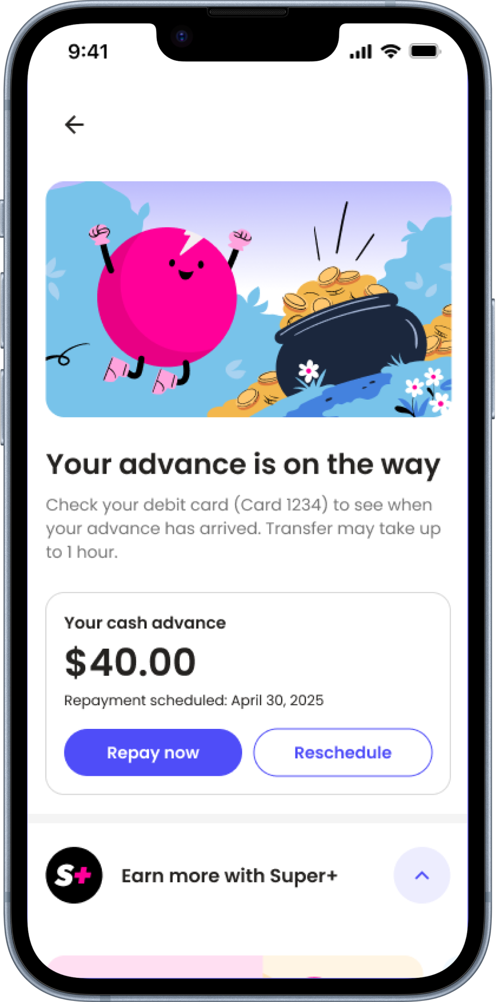
Lack of Confirmation (2-Day Mark): Most users (4/5) were confused and felt it was a poor user experience when the Cash Advance Hub failed to visually change after two days to confirm the advance had been received in their account.
Repayment Penalties Unclear: Throughout the process (Review and Hub screens), users consistently noted that information about possible penalties for late or non-repayment was missing.
Two-Week Change Was Late: Users were surprised when the screen finally changed at the two-week mark (to offer a new advance), but many expressed a wish that the 2-day screen had updated as well
STEP 2
Testing an ideal version
Based on the friction points identified in the initial usability test, we designed and tested an Ideal Cash Advance (CA) Hub and Onboarding flow to address user confusion and lack of clarity. This Ideal Version was tested with users to gather feedback on the updated design. The results showed a significant improvement, with users finding the updated CA experience much clearer and more intuitive. We plan to iterate on this Ideal Version and perform an A/B test in production, with a goal to implement the final design in 2026.
Example Screens
Usability Results for Test #2
Improved Clarity and Trust: Users found the updated process intuitive, easy to navigate, and clear from the outset, which built trust and confidence compared to the confusing previous version.
Accessible Key Information: Users appreciated that critical details, such as past advances and educational resources, are now prioritized and displayed above the fold, making essential content more helpful.
Transparent Fees and Onboarding: The majority of users (4/5) understood the sign-up process and felt enough information was present, appreciating the transparency regarding terms and disbursement fees. One user called Super.com better than Dave due to the no-interest, no-credit-check language.
Alignment on Post-Advance Hub: Unlike the first test, the majority of users (3/5) felt it made sense that the hub did not change after two days and did not show frustration or confusion. 4/5 users found the screen updated clearly after two weeks, aligning with their expectations.
Illustration Library
Quick art break! :)
Due to my illustration experience, I got the opportunity to collaborate with the lead illustrator and contribute to the illustration library.

→

More Super.com Case Studies coming soon!