
Nuestro Chicago Archives is a digital archive page that highlights and preserves Chicago’s latine community through family photographs. Established in September 2024, N.C.A seeks submissions from all neighborhoods of Chicago before 2008.
Design: Creative Direction, Branding, & Merch


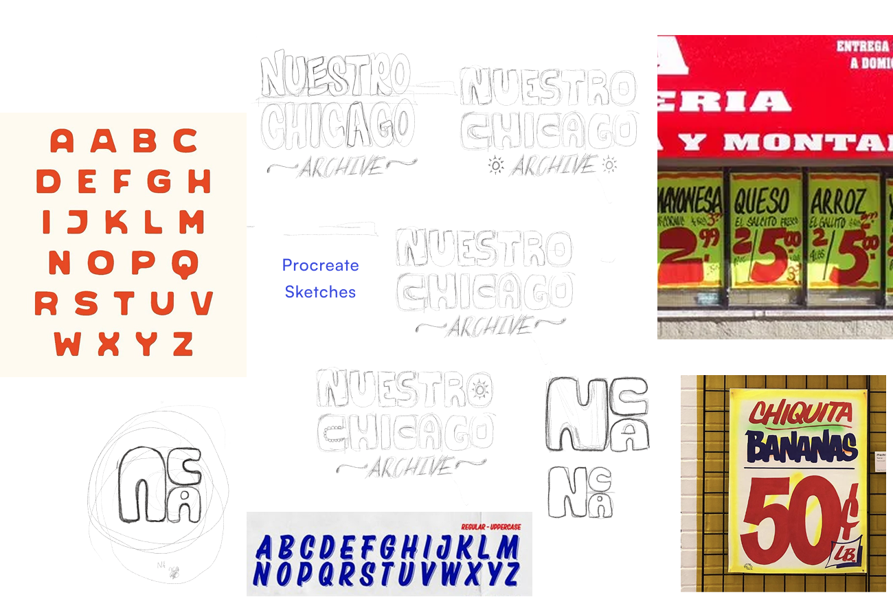
STEP 1
Exploration
The client wanted to fully brand their organization to kick-start their one-year anniversary event. They wanted a retro-like logo, that also had a touch of the stylistic approach from the Chicago grocery store signs, which is something that is easily recognizable to the community here. My goal was to take in all this inspiration and create something that would touch on people’s nostalgia.
STEP 2
Type & Color
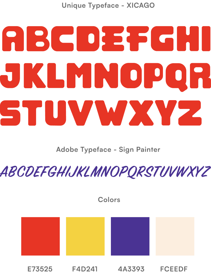
Taking in the client’s inspiration, I was able to create a unique typeface that would reflect their brand. The goal was to utilize similar colors of the infamous grocery signs here in Chicago, while adding a retro-like feel to the over style.
STEP 3
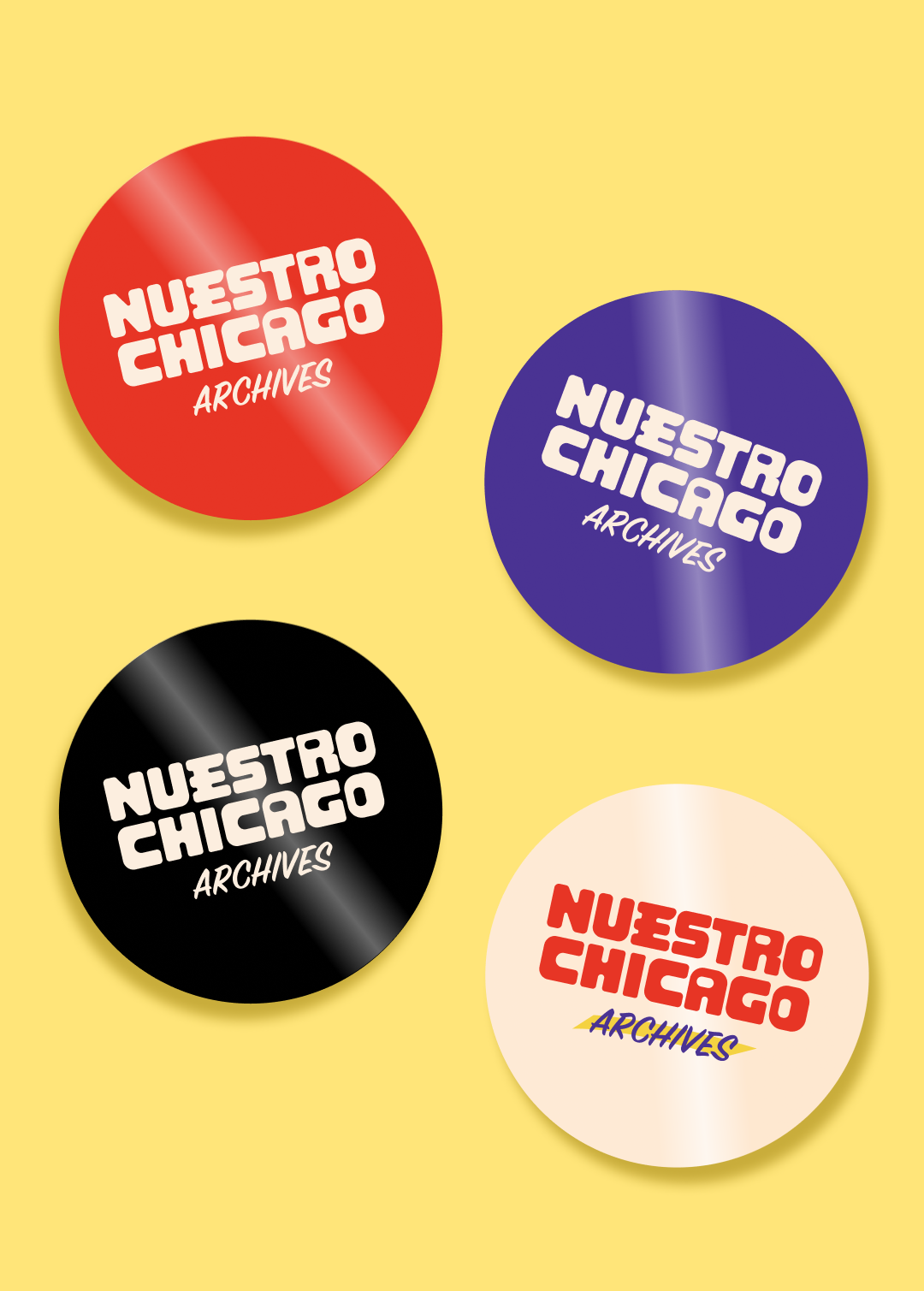
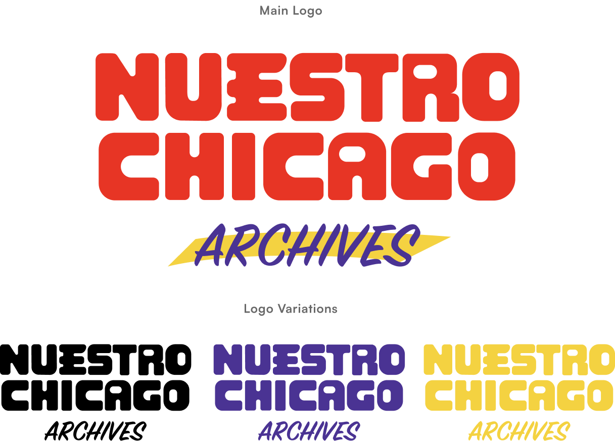
Final logo
I was able to find a balance with the nostalgic style of the Chicago grocery signs and the retro feel that my client was looking for. My goal was to stay consistent throughout the branding process, but also give my client enough variation so they can utilize their logo on multiple collateral such as print, socials and merch. This mean providing multiple color options that they can utilize depending on their preference.
FINAL STEP
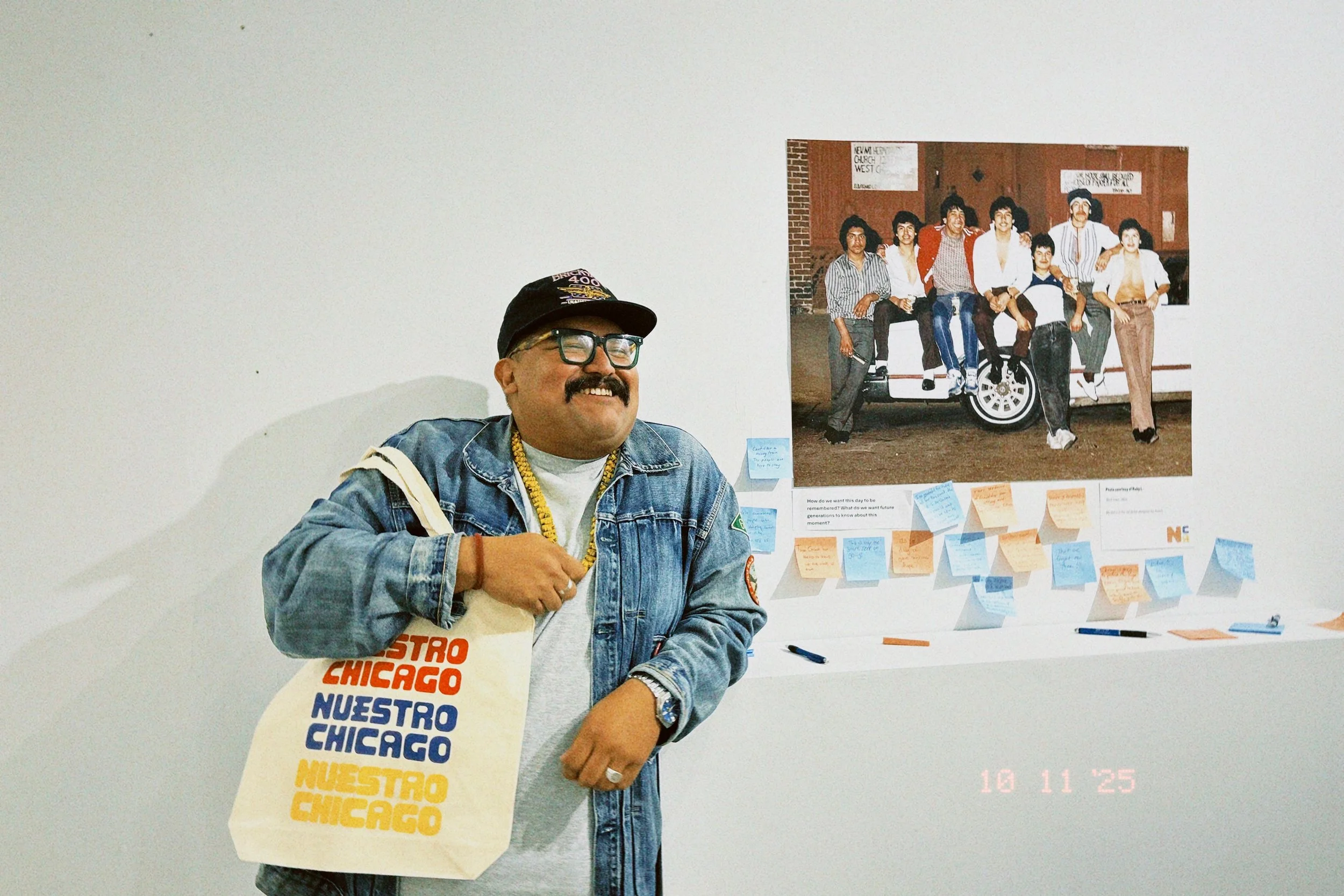
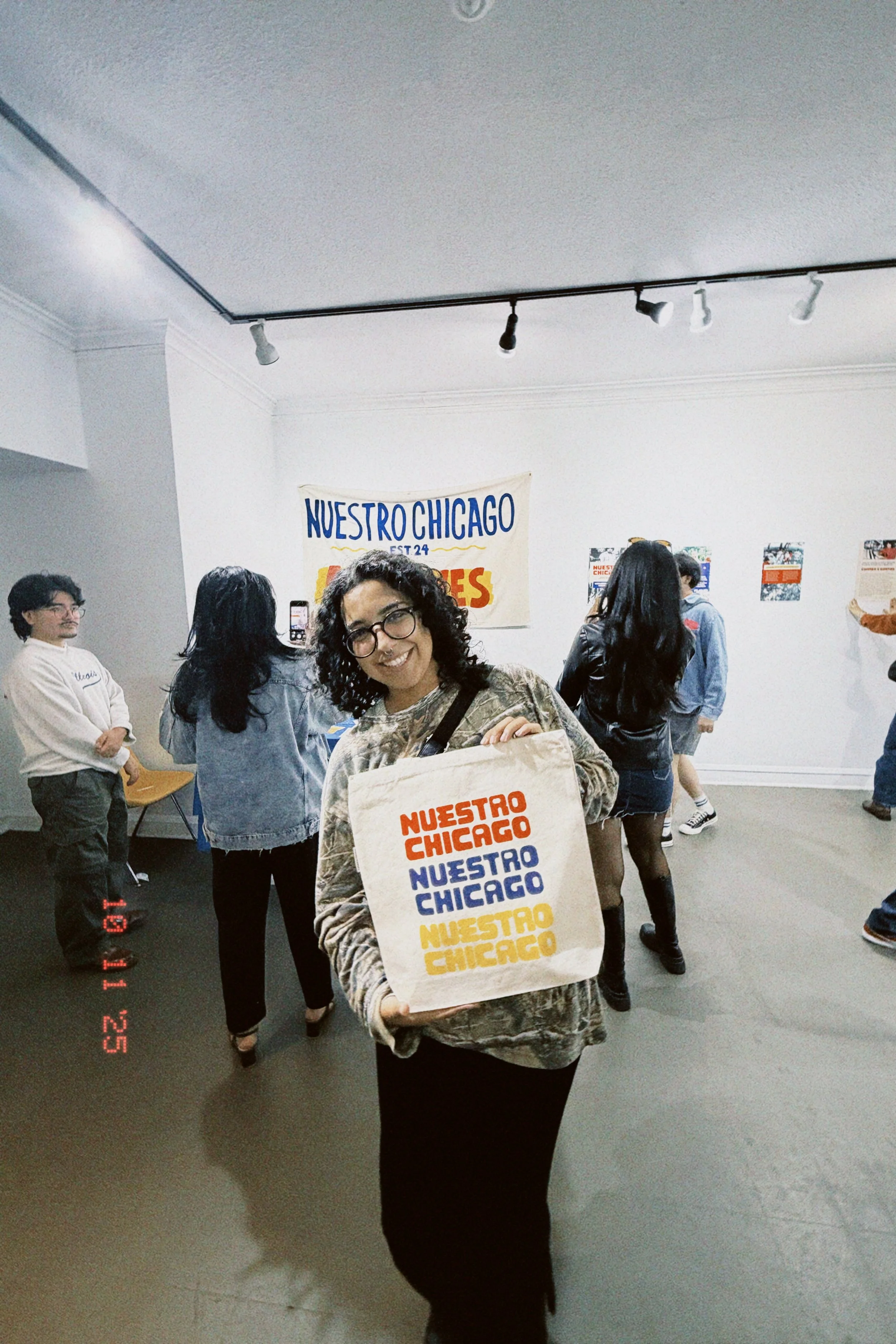
In production
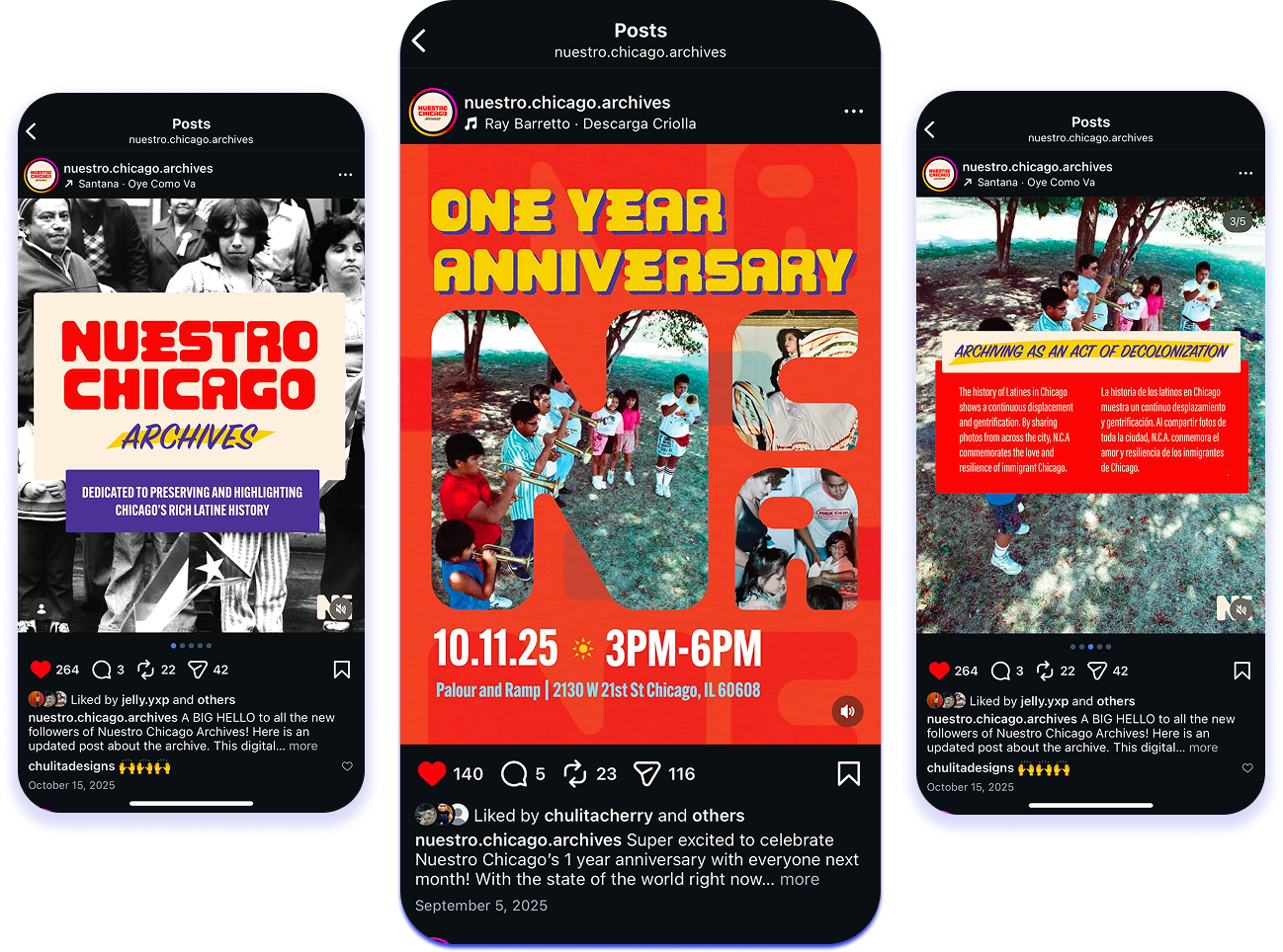
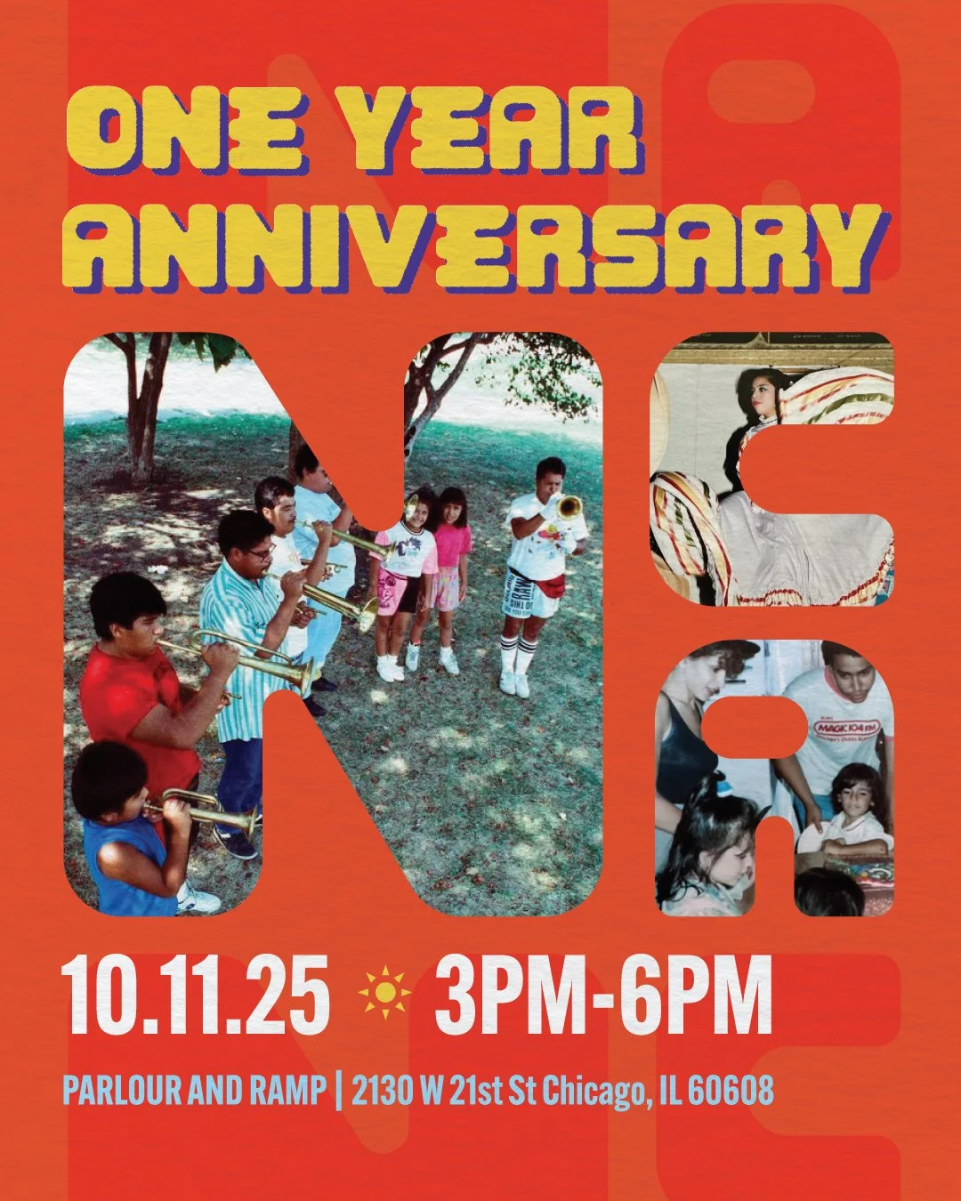
Designing an specific look to the brand helped the overall organization have a more consistent look for their social media which led to higher engagement in likes, reposts & overall shares.
All in all, the branding became a success. The client and I collaborated on the merch and marketing materials which led to a turn out of 100 people, and 100% merch sold.